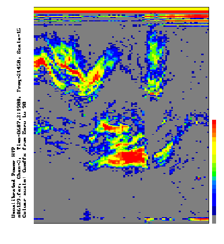
| The usual way of displaying VLF Doppler experiment data is by plotting a graph of group delay (ms) against time (UT), with the signal intensity of the whistler-mode signals represented by a colour scale as shown in the figure. The group delay scale is usually 0-970 ms, while the time axis is typically about 24 hours long and has a time resolution of 15 minutes. At this stage there has been no attempt to remove the nonlinear response of the experiment and the colour indicates the magnitude of correlation coefficients between the whistler mode signal and the sub-ionospheric signal. Distinct peaks in the correlation coefficients are interpreted as representing field-aligned paths of plasmaspheric propagation (ducts) and these can be seen to change in group delay over periods of several hours. Similar plots can be used to study whistler-mode doppler shifts and arrival bearings, each represented by the colour scale. | ||
 |